Saturday, 10 October 2015

Learn awesome page numbering tricks for Microsoft Word – Designing your Page numbers

Ms office helps 2013 - Learn awesome page numbering tricks for Microsoft Word – Designing your Page numbers
Hello all,

Have you ever wondered about creating different/unique page numbers? With lovely colours and better designs than the default “1,2,3”stuff?

We are approaching the end of the year and you might probably be thinking of typing an annual report for the year 2015. Or maybe, you are preparing a newsletter for your customers/clients that you will likely convert to a pdf and you really need the document to look unique and professional. Am here with the right article for you.

This article will be emphasizing more on page number design… I will definitely publish more tutorials on designing/creating a unique body for your newsletters, layout type to use, fancy header designs and so on but for now, let’s focus more on page number design.

Let’s get started
If you don’t know how to insert a normal page number, follow these steps below.
  1. Go to insert and click Page Number 
  2. Choose where you want it to be (up, down, right left or centre).

That’s all… Now, time for the fun/interesting part 

  • How to make it look Unique

Are you aware that the way Microsoft word numbers a page is through “header and footer”? If you don’t know that before, you actually do now. 

Another thing is that, header and footer repeats all over your available document pages. So what we are going to do is to place some shapes inside the header and footer region. Let’s begin…
  1. Create a page number and place it at the bottom right.
  2. Double click the created page number to open the header and footer tools. 
  3. Now, grab your mouse and click insert, shapes, and choose any shape you like. I chose a pentagon, turned it around and I filled it with orange colour and did some gradient fill for it.
  4. I duplicated the same pentagon shape, increased the size and fill it with white. Sent it behind the yellow pentagon. Finally, I placed a small circle at the top and painted it white. Check pics below 
  5. Place the shape on top of your number and send it to the back so that your number would be visible.
  6. After which, click “Close header and footer” at the top right corner of your screen.
  7. Scroll down all pages and see what appears.

That’s just it! 

This is just a basic page number design. You can keep tweaking it as you like; maybe placing two different shapes side by side or changing their colours. You can also draw shapes yourself with the pencil tool.

Tip: You can use your company logo instead of the basic shapes.

I will keep on posting more tutorials under this topic (advanced designs). Make sure you subscribe to my post in order not to miss any of them from this blog and remember, articles on letterhead designs are coming. Thanks!

Blogger Widgets

Monday, 10 August 2015

Letterhead Template Design Download - Cool Boxes

Hello friends,

Have you experienced that moment when you really need to design a letterhead but you have no time doing it? Either you are in a hurry or your head is not calm to design something... I designed these letterheads for that awkward moment. 

About the letterhead:

I made it with some few boxes resting at the top of the page and some right/left angled shape like things at the bottom to give it some cool effects. The company name was typed with Audiowide font type which you can change by clicking on it and retyping in the invisible box (no outline box). This letterhead is really cool for some company type. 

You can make changes to it as you like because it's not lock. I made some few colours like about 6 different colours types. If after downloading the zip file below, you then noticed that your company colour is not in any of the designs, you can edit one of them and change the colour to that of your company. It's really easy to do.

To change the colours at the top of the screen, click on each individual box and choose a new colour. Same goes with those shapes below. All you need do is click and choose a new colour.

Download this Letterhead by clicking here - COOL BOXES LETTERHEAD 

Please if you are having a problem withe the above link, do leave a comment below about it.

If you edited yours, you can take a snapshot of your new result and upload it in the comment box. Thanks!

How to design an envelope using Microsoft Word 2013

Hello friends,

Am here with another interesting tutorial for you today; How to design an envelope using Microsoft Word 2013.

If you missed my last article on how to design a cover page for your document, click here now.
So, let’s get started immediately!

STEPS
1. Launch Ms Word 2013 then go to page layout and change the size of your paper to Envelop #10 and also change the orientation to Landscape.

2. Go to Insert and select shapes. Choose the Rectangular shape and draw it on your document. Stretch the edges till it touches all edge of the paper size (envelope).
Now go to Drawing tools – Format Menu and fill it with Black. Then go to gradient and change some settings. Check picture below

Note: If you don’t want such heavy colour because of your printed ink, you can choose a light colour like light grey or faint blue or any other light colour of your choice.

3. Go to Insert again and choose Triangle then insert it. Rotate it to the right then click the edit shape icon and choose Edit points.

Go to the corners of the shape where you have a node (point), shape them until it looks like mine then fill it with orange.
After that go to Shape fill and click gradient. Select the icon I selected below. Place the filled triangle to the bottom right of the black background making it touch the bottom line and the right line.

4. Now duplicate that triangle and fill it with black (100% black). In the Format menu, click Send Backward to move it to the back of the orange triangle and in front of the black background.

If you aren’t getting it right, you can bring the two shapes (the two triangles) out and place them appropriately.

5. Insert a text box and type in it “Microsoft Office Helps”. Rotate the text box in order to make the text rotate and place it beside the triangular shapes. Fill the Text with Orange colour and the outline with Black. In this tutorial, I used Slant as my font type; size 24.
Highlight the beginning “M” and increase the font size to 36.
Now double click on any of the text box outline; you will be in the format menu. Choose no Colour Outline and No Colour fill.

6. Insert a straight line, rotate and place it above and below the company name as I did mine.

7. Insert another text box with no outline colour and no fill colour. Type in it your company slogan and colour it white then place it below your company name.
Note, do not fill the box with white but the text in it.

8. Insert your company logo and place in at the top centre of the black background or you can also place it on top of your company name and rotate it to fit better. It’s your choice.

9. Finally, insert a text box with no fill and outline colour then type in your company address, phone number, email address and every other information at the bottom left of the background and fill in with orange colour.

You are done! That is your design for you.

Remember, you are not limited because you can experiment with things and colour to see the one that matches your company better. If your company official colour isn’t orange, you can still use that colour and it will go well with the design.


Try this today and don’t forget to share. If you have any questions, drop it below!

Thursday, 9 July 2015

How to Retain a Document in Your Open Recent Document List Forever

Hello friends,

There are some important documents that we always wish to access very quickly but most times we end up searching for them. If it’s an emergency, it’s not good to be wasting time all because you are searching for a particular document that’s why I thought about this tutorial. If those documents are very close to you, it won’t be a problem locating them. If by going to Open existing documents, you immediately see such document, that will be very good but if it’s been long you typed/edited that document it might not be in the recent document list.

It is very annoying to be searching for a document whenever you need it. I don’t know about you but I really hate looking for something. 

Now the basic concept is this, assuming this particular document is pinned somewhere like a sheet of paper on a board or something, it will be very easy to locate right? That’s what we are going to do. We will pin that document somewhere so that whenever we need it, we will be able to lay our hands on it quickly.

How to Pin a Document
  • Open Microsoft office word then open that particular document
  • After that, go to file and click Open. Locate that particular document with it name and hover your mouse on it.
  • You will notice that pin icon by the right of the name, click on it.
  • By doing that, the document is forever pinned on your open recent document dialogue box. Anytime you need to open it, just go to open recent and you will see that particular document waiting for you to click it.

See, it is very easy to do. 
You don’t need to be looking for that document again. Cool ehn?

Share this with your friends…

Wednesday, 17 June 2015

How to Design this Dark Cover page on Microsoft Word 2013

Hello friends,

Am here with another “How to” tutorial just for you.

When typing an article, project or some special documents, cover pages are essential because they don’t only make the document look good but they also make it look ehmm ehmm presentable.
Am here with a cover page design that I want to teach you how I made mine and also, give you a link to design this one I made in case you will like to use it. So, let’s dive into the process…

What you need
A rectangular box, some straight lines and few text boxes.

How to Design this Cover Page
1. First of all, insert a rectangle and fill it with Black and choose no outline. Size 29.95cm x 4.79cm

2. The image still selected, go to Shape Effects, click Soft edges and choose 5 points. Move it to the left part of your page.
3. Insert a small horizontal line like this and duplicate it.
Little help: You can insert one, copy and page to insert five more then group then and duplicate further. How to group: Use Ctrl + Click to select your objects then right click and click group.


4. After duplicating, arrange them well and place them on the black rectangle shape you created. Change the outline to Black 35% lighter.

5. Draw a straight line then use it to cross the small lines you created before; the straight long line should run from up to down. Use the same outline colour for it. Duplicate that same line and place it at the edge of the rectangular shape (towards the left).

7. Now, insert a text box and place it at the top of the page. Remove the outline. Then go to Shape Effects and choose shadows. Select Offset diagonal bottom right shadow under outer. (Hover your mouse around them to see their names.

8. You can now type your topic / document name in the box. I used Denk One as my font and 48 as my font size because the topic I wrote isn’t that lengthy. But if you know your topic might occupy two to three lines, you should reduce the font size.

9. Highlight your topic / document name then go to Format menu. Under WordArt style click the Text Effect Logo – Reflection then click Reflection options at the bottom. Type in those values as they are in the image below.
10. Insert another text box for the Abstract. You can use Calibri for the font and 12 / 14 for the font size.

11. Insert another text box for the bottom text that will harbouring the company’s name / author’s name / your name etc. change the margin type to right margin and also use Calibri 12 while the company name can have a bigger font size.
 
That’s all and that will be your result like mine. If you have any question, comment about it below.


Friday, 12 June 2015

How to Remove Border Lines of a Table

Ms Office Helps 2013 - How to Remove Border Lines of a Table
Hello friends,

I want to share this article with you all because I believe that you really need it.

Have you been in that situation when you insert a table and you feel like removing some border lines in it? You must have tried everything you can think of but to no avail. The funniest thing is that all you need to do in order to remove those lines is just to highlight and click! Want to know what to click? Read On…

How to Remove Table Borders
  • Create a new document or open an existing word document.
  • Create a table. If you don’t know how to create a table,click here.
  • After creating a table, highlight the entire table
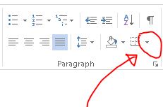
  • Now click on this icon below. (it’s located under the home menu – in paragraph)
    Ms Office Helps 2013 - How to Remove Border Lines of a Table
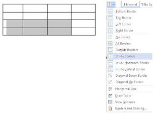
  • From the drop down menu list, choose no border.
  • Immediately, the entire borders of your table will disappear.

Note: This is for the entire table but if you want to remove some particular cells of the table, highlight them (the cells) and choose the corresponding options from the drop down menu.

For example, if you want to remove the left and bottom border of the table, you just have to highlight the cells you want to edit then choose left and bottom border from the drop down menu.
Ms Office Helps 2013 - How to Remove Border Lines of a Table


Note: After removing the table border, that doesn’t mean that you have deleted the table. It’s just that you made the borders invisible. You can still bring back the invisible border by clicking the corresponding option.

Follow these steps carefully, if you encounter any problem, do let me know through the comment bar. I will definitely respond to your questions as quickly as possible.
  

Wednesday, 10 June 2015

How to Design a Simple Id Card in Microsoft Word

Ms office helps 2013 - How to Design an Id Card in Microsoft Word
Hello friends,

Let do something difficult now… We are going to design an easy Id-Card using Microsoft word 2013. Put on your thinking cap now because we are going to do some thinking!

Designing with Ms word is kind of stressful and hard but if you know your way around it, it won’t be that difficult - believe me.

What I use majorly in designing with Ms word is Text Box. Why? Because it enables me move text around anyhow I want. So let’s get started… designing all the way!

What you need
Ms office helps 2013 - How to Design an Id Card in Microsoft Word


Steps

1.   Go to Insert then click shapes. Choose the text box (the shape shape with the logo having an A) and draw a rectangle.
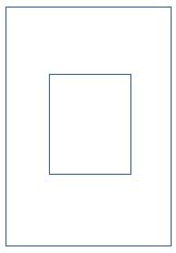
2.   After drawing the rectangle, go to size at the top right part of the screen (in format tab) then make the height = 8.13 while the breath = 5.59. huhala! You have gotten the id card outer box shape.
Ms office helps 2013 - How to Design an Id Card in Microsoft Word

3.   Now click on the outline of the box then do Ctrl + d to duplicate it.
4.   Reduce the size to a passport size and put it at the middle of the first rectangle created.
Ms office helps 2013 - How to Design an Id Card in Microsoft Word

5.   Insert a text box then remove the outline and fill colour.
Ms office helps 2013 - How to Design an Id Card in Microsoft Word
6.   Now write the company name there. In this tutorial, the name of this blog was used. So, you can write icrosoft office in the box. Notice that the M is not there. We are going to create the M with another text box.
Font type – Berlin San FB
Font Size – 14
Colour – Orange
Outline – Black
Ms office helps 2013 - How to Design an Id Card in Microsoft Word

7.   Create another text box (with no outline and fill colour) for the letter M. type M in it.
Font type – Joker Man
Font Size – 22
Colour – Orange
Outline – Black

8.   Now place the two of them together inside the outer box like this. Check picture below. (the arrow indicates the outer box)
Ms office helps 2013 - How to Design an Id Card in Microsoft Word

9.   After that, duplicate the icrosoft word text box for the slogan. Erase the previous text in it and type “…giving you the best of tutorials”.
Font type – French script MJ
Font Size – 10
Colour – black
Ms office helps 2013 - How to Design an Id Card in Microsoft Word

10.   Do the same for the address, telephone number and email
Font type – Calibri
Font Size – 6
Colour – black

11.   Create another text box for the “Helps” close to the Microsoft Office to complete the company’s names.
Font type – Freehand 521 BJ
Font Size – 10
Colour – orange

12.   Drag and place at the right hand side of the Microsoft word. Check pics below
Now, let’s do below. Go back to the Email text box, click on it, then duplicate it. Drag it down (below the passport box) then edit the text. Write the name of the employer/employee.
Font type – Calibri (bold)
Font Size – 14
Colour – black

13.   Duplicate it again for the position held and “sign”.
Font type – Calibri
Font Size – 10
Colour – black
Ms office helps 2013 - How to Design an Id Card in Microsoft Word

14.   For the bottom, create a box then duplicate it. Place them side by side at the bottom of the outer box of the id. Paint the first box Orange and the second Yellow.

Ms office helps 2013 - How to Design an Id Card in Microsoft Word

Duplicate a text box at the bottom (either the sign text box or the name of the employee or employer).
Font type – Calibri (bold)
Font Size – 11
Colour – white

15.   Type IDENTIFICATION CARD in it and place it at the middle of the box explained above (the painted box).

16.   Scan and place your signature.

17.   Insert your company logo

18.   And insert your passport. Loolzzz don’t mind my passport, during the drafting of this tutorial, I couldn’t get my passport, so I had to sketch something for this. Looks like me though lolz lmao

19.   You are missing something right? I sketched a little shape which I placed at the back of the passport.
to do this, go to insert then click shapes. Choose Scribble (scribble is just like freehand pencil in corel draw).
20.   Now use it to sketch exactly this shape below. Duplicate the shape and mirror it.
21.   Paint one light yellow and the other light orange
Ms office helps 2013 - How to Design an Id Card in Microsoft Word

22.   Place in them both behind the passport box, infront of the outer box. Use the Bring Forward and Bring backward function wisely here. (to locate that, go to the format menu and check the right corner.
Ms office helps 2013 - How to Design an Id Card in Microsoft Word

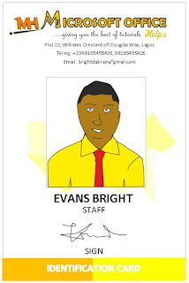
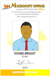
23.   Place them well just like mine and this will be your final result!
Ms office helps 2013 - How to Design an Id Card in Microsoft Word


Hope you got it? Let me see your image in the comment region…


Like Us on Facebook